Angular Semantic UI Popup Modal | ng2-semantic-ui example

Learn Angular Modal Example with Semantic UI Library.
Angular Semantic UI modal
Every UI library provides Different UI components. In the same way, Semantic UI provides different UI components including a Modal window.
A modal is a window or popup which blocks the main page and displays a popup view where this view contains content displayed or accepts inputs from the user.
Modal integrates on any page of the web application. The below code works on Angular 15,10 versions.
Integration Semantic UI in Angular Application
- Create Angular Application using angular CLIL
- Install the ng2-semantic-ui npm package in the application.
- Import SUIModule in Angular Application
Details documentation for the above steps found in ng2-semantic-ui integration with Angular Framework.
Once the Application is integrated, Write a code for the semantic UI modal.
Semantic UI modal Example
This example explains about basic modal window with
- How to Open Semantic UI modal from a button click
- Close Modal event using modal.deny() event
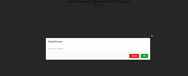
On an HTML page, Displayed a button, On clicking this button, Open a modal window, where the user closes the window using buttons on the window.
app.component.html:
<div style="text-align:center">
  <h1>Angular Semantic UI Modal With Example</h1>
</div>
<div style="text-align:center">
  <button (click)="show = true">Show Modal</button>
  <sui-modal *ngIf="show" [isClosable]="true" (dismissed)="show = false" #modal>
    <div class="header">Modal Header</div>
    <div class="content">
      <p>This is Test Content</p>
    </div>
    <div class="actions">
      <button class="ui red button" (click)="modal.deny()">Cancel</button>
      <button class="ui green button" (click)="modal.approve('done')" autofocus>
        OK
      </button>
    </div>
  </sui-modal>
</div>
app.component.ts:
import { Component } from "@angular/core";

@Component({
  selector: "app-root",
  templateUrl: "./app.component.html",
  styleUrls: ["./app.component.css"],
})
export class AppComponent {}
Output:
sui-modal is a page for Modal which contains the following attributes
Semantic UI modal Properties
isClosable: True/false values for Displaying the close button or not. If no close button, the Modal will be closed using the ESC key or clicking outside modalcloseResult size: It defines the size of the displayed modal - Values are mini, tiny, small, normal, and largeisFullScreen: true/false values which show modal in full-screen width or nottransition: It is to configure animation effects for displaying modal, Scale is by default.transitionDuration: period on which transition effects take place
Angular Semantic Modal Events
These events call after the modal closes and events are fired.
approved: This event is called when modal.approve(‘done’) is calleddenied: This event is called when modal.deny() is calleddismissedThis calls after the modal closes
Header,content, footer sections
Each Modal contains three divs sections.
Header: Header or title of Modal windowContent: Actual content which can be HTML/CSS contentActions: This is a footer of a modal window that contains buttons for open/close/custom events.
Conclusion
In this tutorial, You learned the Semantic UI modal in Angular with properties events and different sections such as header content and footer section.