Learn Reactjs Date picker with examples
Datepicker is an important form element of a web page, It is used to select the date from the user.
The date picker contains an input text box and overlay calendar shown on focus input control. It enables a selection of dates and times.
Users can use a textbox to take the date. Why date picker is required?
Date picker has some advantages.
-Force or restrict the user to accept the valid dates only
Entering user dates manually is error-prone, so clicking with the date-picker is very smooth and easy
Can also customize to add today buttons.
Styles specific dates with some colors, for example, holidays
Date range can also be added.
In this example, Learn how to integrate the date-picker npm library in the Reactjs Application.
Let’s get started!
Create a new React Application
Now Let’s create a new React application with folder structure using the npx create-react-app CLI command.
npx create-react-app react-datepicker-examples
This creates react project folder structure and installs required dependencies.
Go to the application root folder, and Install react-datepicker into react application.
npm install react-datepicker --save
This will install the dependency and add an entry in package.json as below
  "dependencies": {
    "react-datepicker": "^3.4.1",
  }
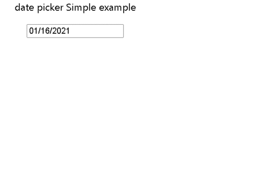
Simple Date picker in reactJs
This is a simple date picker with setting the current date into a state object
import React, { Component } from "react";
import DatePicker from "react-datepicker";
class Simpledatepicker extends Component {
  constructor(props) {
    super(props);
    this.state = {
      selectedDate: new Date(),
    };
  }
  onChangeEvent = (event) => {
    console.log(event);
    this.setState({ selectedDate: event });
  };

  render() {
    return (
      <div>
        <p> date picker Simple example </p>
        <DatePicker
          selected={this.state.selectedDate}
          onChange={this.onChangeEvent}
        />
      </div>
    );
  }
}

export default Simpledatepicker;
useState hooks functional component
Similarly, The same class component can be rewritten using the functional component and useState hook. These components are also called functional components.
Hooks in react add functionalities to functional components.
Here useState hook adds state to this.
const [currentDate, setCurrentDate] = useState(new Date());
The above line of code specifies two things
- Current date is declared as a parameter in the useState hook, which is an initial value
- currentDate is a state variable that will be initialized with the current date returned from useState
- setCurrentDate is the function that updates state variable, here currentDate.
Steps required to use date picker component.
- Imported Date picker inside a component
- selected inside DatePicker is selected date in component.
- onChange is an event handler, called whenever a component changes its value
- It calls setCurrentDate to select a new date
Complete component code:
import React, { useState } from "react";
import DatePicker from "react-datepicker";

const Datepickerhooks = () => {
  const [currentDate, setCurrentDate] = useState(new Date());

  return (
    <div>
      <DatePicker
        selected={currentDate}
        onChange={(date) => setCurrentDate(date)}
      />
    </div>
  );
};

export default Datepickerhooks;
And the output,
Add placeholder to date picker component
Placeholder is an initial value to be displayed in the input box before selecting the date value. A placeholder is a string and not empty and the selected value should be false values like empty or false. Please note that placeholder value is only shown when this.props.datevariable or this.state.the variable value is a false value.
<DatePicker
  placeholder="Please selecte Date of birth"
  selected="{this.state.selectedDate}"
  onChange="{this.onChangeEvent}"
/>
Display time picker to component
By default, the date picker does not show time information in the date picker.
There are showTimeInput option displays current time + select icon to change time as show below
<DatePicker
  showTimeInput
  selected={currentDate}
  onChange={(date) => setCurrentDate(date)}
/>
Output:
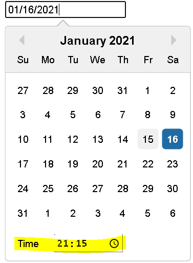
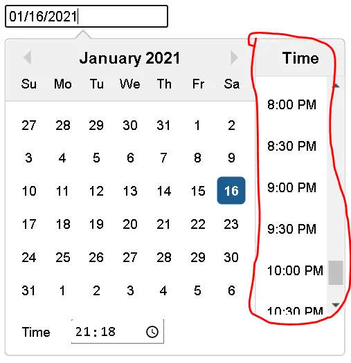
showTimeSelect attribute adds a time picker component into a component
Time will be shown in range of 30 minutes interval, These intervals can be configure using timeIntervals
<DatePicker
  showTimeSelect
  selected={currentDate}
  onChange={(date) => setCurrentDate(date)}
/>
Output:
Complete example code:
import React, { useState } from "react";
import DatePicker from "react-datepicker";

const DatepickerTimehooks = () => {
  const [currentDate, setCurrentDate] = useState(new Date());

  return (
    <div>
      <DatePicker
        showTimeInput
        timeFormat="HH:mm:ss"
        timeIntervals={15}
        timeCaption="time"
        showTimeSelect
        selected={currentDate}
        onChange={(date) => setCurrentDate(date)}
      />
    </div>
  );
};

export default DatepickerTimehooks;
timeFormat is formatting the time to be displayed on the time picker. timeIntervals is an interval of time to be displayed on it timeCaption is the text displayed on the caption shown to the component.
To display a time picker without a date picker.
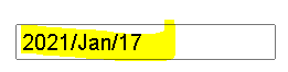
set the date format to YYYY/mmm/dd in a component
by default, date picker displays date dd/mm/yyyy format.
If custom date format is required, Then dateFormat option is to be used
<div>
  <DatePicker dateFormat="yyyy/MMM/dd" selected={currentDate} onChange={date =>
  setCurrentDate(date)} />
</div>
Output:
Add CSS styles or class names in the date picker component
className attribute adds styles to the input box in the date picker. And its value is CSS classname declared in CSS class at global or component level
import React, { useState } from "react";
import DatePicker from "react-datepicker";

const DatepickerComponent = () => {
  const [currentDate, setCurrentDate] = useState(new Date());

  return (
    <div>
      <DatePicker
        dateFormat="yyyy/MM/dd"
        className="inputStyles"
        selected={currentDate}
        onChange={(date) => setCurrentDate(date)}
      />
    </div>
  );
};

export default DatepickerComponent;
Declared inputStyles in App.css
.inputStyles {
  outline: none;
  border-radius: 5px;
  border: 1px solid blue;
  font-weight: 700;
}