Angular upload file with primeng | p-fileUpload example

primeng is a Rich UI component library for the angular framework, It provides a lot of reusable components like buttons, input controls, data tables, and File upload.
This blog explains the integration of Primeng in the latest Angular versions and uploads buttons with examples.
It also explains how to hide/show primeng upload buttons.
Create a new application
First, Let’s create a new application angular-upload using the angular cli tool, ie ng command.
Next check ng command is installed or not.
ng --version
if the version is not displayed and gives the ng command not found error, Install the Angular cli tool using the below command.
npm install -g @angular/cli
Create an Angular application using the ng new command
ng new angular-upload
This creates a new application angular-upload application folder.
Go to the application folder in a terminal window.
Adding primeng to Angular application
You have to install primeng and icons dependencies in the Angular application using the npm install command
npm install primeng --save
npm install primeicons --save
This installs dependencies into an angular application and adds the below entries in package.json
  "dependencies": {
    "primeicons": "^4.1.0",
    "primeng": "^11.2.3"
  }
Primeng dependencies are added to the project, Next, we need to add styles.
Adding primeng styles and icons to the Angular project
primeng components need three kinds of CSS styles required to add to the angular project
- theme file, Theme file is needed as every component in primeng changes its styles as per the theme. You can check different themes available in the
node_modules/primeng/resources/themes/folder of your project - core CSS styles are the primary styles required.
primeng.min.css - icon file, Each component inbuilt integration with
primeicons, you can check more here.
Angular.json is added with the below entries.
"styles": [
              "src/styles.css",
              "node_modules/primeng/resources/themes/nova/theme.css",
              "node_modules/primeng/resources/primeng.min.css",
              "node_modules/primeicons/primeicons.css"

]
Primeng provides each component in the form of Angular modules,
So, to add the upload button, the FileUploadModule module needs to be imported into the Angular module.
Import FileUploadModule in App.module.ts
import file upload module into the app.module file so that upload components are available in the primeng application.
Let’s create a basic file upload component.
Basic File upload example
First, Create an angular component using the ng g c componentname command.
B:\\angular-upload>ng g c BasicFileUpload
CREATE src/app/basic-file-upload/basic-file-upload.component.html (32 bytes)
CREATE src/app/basic-file-upload/basic-file-upload.component.spec.ts (691 bytes)
CREATE src/app/basic-file-upload/basic-file-upload.component.ts (317 bytes)
CREATE src/app/basic-file-upload/basic-file-upload.component.css (0 bytes)
UPDATE src/app/app.module.ts (671 bytes)
A simple component is created,
Let’s add p-fileUpload component into html template
In HTML template
<p>Basic Primeng Upload</p>
<p-toast position="top-left"></p-toast>

<p-fileUpload
  name="docs[]"
  multiple="true"
  accept="image/*"
  maxFileSize="2000000"
  [showUploadButton]="true"
>
</p-fileUpload>
Typescript component code
import { Component, OnInit } from "@angular/core";

@Component({
  selector: "app-basic-file-upload",
  templateUrl: "./basic-file-upload.component.html",
  styleUrls: ["./basic-file-upload.component.css"],
})
export class BasicFileUploadComponent implements OnInit {
  ngOnInit(): void {}

  onSelectEvent(event) {
    console.log("Selected files", event);
  }
}
The file upload button on the webpage is
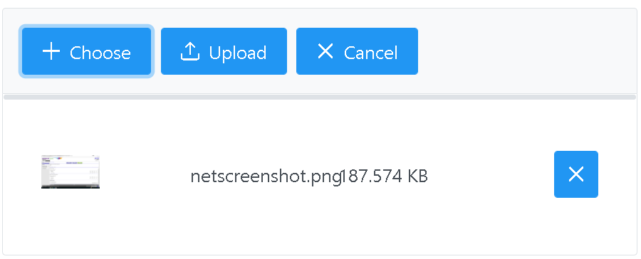
How to Hide the upload button in upload?
Sometimes we want to customize the file upload button to hide some of the buttons.
By default, p-fileUpload component provides choose, upload, cancel buttons.
show or hide buttons can be done with attributes or CSS styles
attribute It has the following attributes to enable or disable upload buttons.
showUploadButton - Boolean value to enable or disable the upload button showCancelButton - Boolean value to enable or disable the cancel button
the below code disables the upload and cancels button
<p-fileUpload
  name="docs[]"
  multiple="true"
  accept="image/*"
  maxFileSize="2000000"
  [showUploadButton]="true"
  [showCancelButton]="true"
>
</p-fileUpload>
The above code only disables buttons, stills buttons are visible but not clickable on a page With CSS, you can have full control.
CSS code to disable the cancel button
.p-fileupload .p-fileupload-buttonbar button:nth-child(3):disabled {
  opacity: 0.5;
  cursor: default;
}
CSS code to hide the upload button
.p-fileupload .p-fileupload-buttonbar button:nth-child(2){
display:none;
p-fileUpload options
The p-fileUpload component has the following inbuilt to customize upload components.
maxFileSize - Provide value in bytes to restrict uploaded documents size. accept - It enable to restrict uploaded file types like xlsx,application/msexcel for excel files. multiple - Allows configuring single or multiple file uploads. If this attribute is not there, only supports a single file. customUpload - Boolean value indicates whether the upload process is manual or custom.
p-fileUpload events:
The following events are provided to customize the upload behavior. the following handers retrieve the files using the property event.files.
onBeforeUpload - This event will be called before the upload process starts. It will be useful to rename the uploaded filenames. onUpload - This will be fired once the upload process is completed onError - Called during an error in uploading a file onProgress - This event is configured to get the status of an upload file process. This will be very useful to add a status or progress bar on uploading large files. uploadHandler - This will be configured and fired when the custom=“true” attribute is set. We have to provide custom upload manual logic.
upload errors
This section explains errors that occurred in the integration of primeng file uploading in the Angular application. NullInjectorError: No provider for MessageService!
If you want to display upload process errors or information messages, We can use toast or custom alerts.
You have to use toast in the Angular component like this, you have to pass in the constructor MessageService is required to pass toast information during the upload process
constructor(private messageService: MessageService) { }
You used to get the following errors.
ERROR NullInjectorError: R3InjectorError(AppModule)[MessageService -> MessageService -> MessageService]:
  NullInjectorError: No provider for MessageService!
    at NullInjector.get (http://localhost:4200/vendor.js:26101:27)
    at R3Injector.get (http://localhost:4200/vendor.js:26268:33)
Solution, First, import MessagesModule int app.module.ts.
import { MessagesModule } from 'primeng/messages'; @NgModule({ declarations: [
AppComponent, BasicFileUploadComponent ], imports: [ MessagesModule ],
providers: [], bootstrap: [AppComponent] }) export class AppModule { }
Second, Declare providers:[MessageService] in the Angular component
import { MessageService } from 'primeng/api';

@Component({
  selector: 'app-basic-file-upload',
  templateUrl: './basic-file-upload.component.html',
  styleUrls: ['./basic-file-upload.component.css'],
  providers: [MessageService]
})
export class BasicFileUploadComponent implements OnInit
You can check stackblitz primeng upload full source code here🔗