Angular primeng bar chart example

In this blog post, You’ll learn primeng Bar chart tutorials with examples.
A bar chart is one type of chart displayed in the browser. It is used to display a group of data in rectangular bars.
Primeng Bar p-chart component
First, Import ChartModule into your application. This module provides various chart types
p-chart is a component from ChartModule. Syntax
<p-chart
  type="bar"
  width="400"
  height="400"
  [data]="data"
  [options]="options"
></p-chart>
- Type is a type of chart or graph, In this example,type=bar to display a bar chart
- width - Change the width of a graph container in pixels or percentage
- height - Change the height of a bar container in pixels or percentage
- data - is the data source supplied to the chart.
- Options- Optional configuration provided to customize the bar chart.
this tutorial will not cover how to integrate primeng into the angular application, You can check my previous post about Add primeng in angular application
add ChartModule into the angular application
in the app.module.ts file, import ChartModule into your application module ChartModule provides different components for multiple chart types, Once imported, you are free to access your components.
import { NgModule } from "@angular/core";
import { BrowserModule } from "@angular/platform-browser";

import { AppComponent } from "./app.component";
import { ChartModule } from "primeng";
import { BrowserAnimationsModule } from "@angular/platform-browser/animations";
import { AppRoutingModule } from "./app.routing.module";

@NgModule({
  imports: [
    AppRoutingModule,
    BrowserModule,
    BrowserAnimationsModule,
    ChartModule,
  ],
  declarations: [AppComponent],
  bootstrap: [AppComponent],
  providers: [],
  exports: [],
})
export class AppModule {}
Basic Bar chart component
Created a new component BarChart Component, which displays two types of company data, grouped with the last 6 years of data in rectangular bars.
In bar-chart.component.html, added `p-chart’ component in the HTML template file data is supplied with static dataSource initialized in the typescript component. These data can also be configured to retrieve from API using RXJS Observable.
<p-chart type="bar" [data]="dataSource"></p-chart>
in BarChartComponent.ts,
In this, the variable of data declares of any type, which of type of data format supplied to bar chart. data
import { Component, OnInit } from "@angular/core";

@Component({
  selector: "app-bar-chart",
  templateUrl: "./bar-chart.component.html",
  styleUrls: ["./bar-chart.component.css"],
})
export class BarChartComponent implements OnInit {
  dataSource: any;
  constructor() {
    this.dataSource = {
      labels: ["2015", "2016", "2017", "2018", "2019", "2020"],
      datasets: [
        {
          label: "Company1",
          backgroundColor: "blue",
          data: [25, 30, 60, 50, 80, 90],
        },
        {
          label: "Company2",
          backgroundColor: "green",
          data: [45, 33, 70, 72, 95],
        },
      ],
    };
  }

  ngOnInit() {}
}
And bar chart you see in the browser is

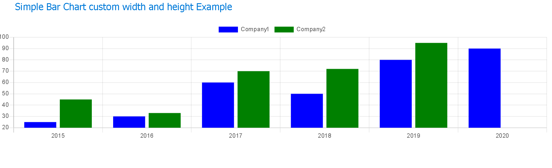
Change the width and height of the bar chart
p-chart component provides width and height properties to change the default width and height of a bar container, not rectangular bars
width and height values can be 300px, 100%, Auto
In this example, no change in the typescript code, changed in In HTML template,
<p-chart type="bar" [data]="dataSource" width="auto" height="250px"></p-chart>
next, save your changes, you will see them in the browser as follows
Customize bar elements
A bar chart uses the `ChartJS’ library, By default chartJS library is automatically installed once primeng is installed This section talks about customizing the legend, XAxis, and YAXis.
p-chart accepts options parameter accepts object options required bar chart, You need to initialize the options in typescript code.
Show or hide Legends with custom font size and color
Declare optionsObject in typescript
optionsObject: any;
Add the below legend object code to the options object display:true/false to show or hide the object labels: Legends labels can be customized with font parameters - fontColor,fontSize, boxWidth and other parameters🔗
      legend: {
        display: true,
        labels: {
          fontColor: "Red",
          fontSize: 25
        }
      },
Hide x-axis, y-axis labels
In the below, XAxis a child of scales parent, display attributes that show or hide the labels of the x-axis or y-axis ticks is a minimum and maximum value to show on-axis line.
scales: {
        yAxes: [
          {
            display: true,
            scaleLabel: {
              show: false,
            },
            ticks: {
              beginAtZero: true,
              max: 100,
              min: 0
            }
          }
        ],
        xAxes: [
          {
            display: true,
            ticks: {
              display: false,
              beginAtZero: 0
            }
          }
        ]
      }
Complete working example for custom bar chart
import { Component, OnInit } from "@angular/core";

@Component({
  selector: "app-bar-chart",
  templateUrl: "./bar-chart.component.html",
  styleUrls: ["./bar-chart.component.css"],
})
export class BarChartComponent implements OnInit {
  dataSource: any;
  optionsObject: any;
  constructor() {
    this.optionsObject = {
      legend: {
        display: true,
        labels: {
          fontColor: "Red",
          fontSize: 25,
        },
      },

      title: {
        display: true,
        text: "% Total Percentage",
        position: "center",
      },
      scales: {
        yAxes: [
          {
            display: true,
            scaleLabel: {
              show: false,
            },
            ticks: {
              beginAtZero: true,
              max: 100,
              min: 0,
            },
          },
        ],
        xAxes: [
          {
            ticks: {
              display: false,
              beginAtZero: 0,
            },
          },
        ],
      },
    };

    this.dataSource = {
      labels: ["2015", "2016", "2017", "2018", "2019", "2020"],
      datasets: [
        {
          label: "Company1",
          backgroundColor: "blue",
          data: [25, 30, 60, 50, 80, 90],
        },
        {
          label: "Company2",
          backgroundColor: "green",
          data: [45, 33, 70, 72, 95],
        },
      ],
    };
  }

  ngOnInit() {}
}
template code is
<p-chart
  type="bar"
  [data]="dataSource"
  width="auto"
  height="250px"
  [options]="optionsObject"
></p-chart>
And displayed output on the browser is
Can’t bind to ‘data’ since it isn’t a known property of the ‘p-chart’ error
This is an angular common error that occurs during the development of using the primeng library
The error is
Can’t bind to ‘data’ since it isn’t a known property of ‘p-chart’. If ‘p-chart’ is an Angular component and it has ‘data’ input, then verify that it is part of this module. If ‘p-chart’ is a Web Component then add ‘CUSTOM_ELEMENTS_SCHEMA’ to the ‘@NgModule.schemas’ of this component to suppress this message. To allow any property add ‘NO_ERRORS_SCHEMA’ to the ‘@NgModule.schemas’ of this component. (” ][data]=“data”>
This will happen when your code is not able to recognize the p-chart tag.
The fix for this issue is to
Check primeng documentation and Please make sure that primeng and required dependencies are installed in your application
Install the latest primeng primeicons and animations npm libraries
npm install primeng --save
npm install primeicons --save
npm install @angular/animations --save
p-chart is a tag or a component of the primeng module `ChartModule’, so have to add these modules,
please import ChartModule into your module as below
import { ChartModule } from "primeng";
And also add a module in the imports section of NgModule.
@NgModule({
  imports: [ChartModule],
  declarations: [AppComponent],
  bootstrap: [AppComponent],
  providers: [MessageService],
  exports: [BarChartComponent],
})
export class AppModule {}