Kendo Angular button tutorial and example

Angular Kendo Button Example: In this example, How to integrate the kendo buttons CSS framework in an Angular application. It also includes how to use the tailwind CSS button in the component.
Angular Kendo Button Example
Step 1 Create Angular Application
Step 2 Start Development Server
Step 3 Add Kendo angular buttons dependencies
Step 4 Add kendo theme and styles to the Angular application
Step 5 Create a button component example
Step 4 Adding Icons to buttons.
Step 5 Button with disabled.
Step 6: Test the Angular Application
Step#1 Create an Angular application
First, Let’s create an angular application using the Angular CLI command
A:\work>ng new angular-kendo
? Would you like to add Angular routing? Yes
? Which stylesheet format would you like to use? SCSS   [ https://sass-lang.com/documentation/syntax#scss
CREATE angular-kendo/angular.json (3249 bytes)
CREATE angular-kendo/package.json (1077 bytes)
CREATE angular-kendo/README.md (1058 bytes)
CREATE angular-kendo/tsconfig.json (863 bytes)
CREATE angular-kendo/.editorconfig (274 bytes)
CREATE angular-kendo/.gitignore (620 bytes)
CREATE angular-kendo/.browserslistrc (600 bytes)
CREATE angular-kendo/karma.conf.js (1430 bytes)
CREATE angular-kendo/tsconfig.app.json (287 bytes)
CREATE angular-kendo/tsconfig.spec.json (333 bytes)
CREATE angular-kendo/src/favicon.ico (948 bytes)
CREATE angular-kendo/src/index.html (298 bytes)
CREATE angular-kendo/src/main.ts (372 bytes)
CREATE angular-kendo/src/polyfills.ts (2338 bytes)
CREATE angular-kendo/src/styles.scss (80 bytes)
CREATE angular-kendo/src/test.ts (745 bytes)
CREATE angular-kendo/src/assets/.gitkeep (0 bytes)
CREATE angular-kendo/src/environments/environment.prod.ts (51 bytes)
CREATE angular-kendo/src/environments/environment.ts (658 bytes)
CREATE angular-kendo/src/app/app-routing.module.ts (245 bytes)
CREATE angular-kendo/src/app/app.module.ts (393 bytes)
CREATE angular-kendo/src/app/app.component.html (23364 bytes)
CREATE angular-kendo/src/app/app.component.spec.ts (1094 bytes)
CREATE angular-kendo/src/app/app.component.ts (218 bytes)
CREATE angular-kendo/src/app/app.component.scss (0 bytes)
√ Packages were installed successfully.

The file will have its original line endings in your working directory
    Successfully initialized git.
It creates an application with default settings and creates an application folder structure with required dependencies.
Once the application is created, Please run the application
npm run start
(or)
ng serve
It runs the angular application and accesses it at http://localhost:4200.
- Step#2 - Add Kendo angular buttons dependencies
First, Install below npm dependencies.
- @progress/kendo-theme-default: The default theme must install using the npm command
- @progress/kendo-theme-bootstrap: Bootstrap-related theme and install if you need bootstrap-related styles for theme and components.
Run the below commands to install the application.
A:\work\angular-kendo>npm install -S @progress/kendo-theme-bootstrap

added 4 packages, removed 1 package, and audited 1056 packages in 11s

93 packages are looking for funding
  run `npm fund` for details

found 0 vulnerabilities

A:\work\angular-kendo>npm install -S @progress/kendo-theme-default

up to date, audited 1056 packages in 3s

93 packages are looking for funding
  run `npm fund` for details

found 0 vulnerabilities
Next, Install @progress/kendo-angular-buttons as a dependency (-S) into the angular app Next, also install it
A:\work\angular-kendo>npm install -S @progress/kendo-angular-buttons

added 25 packages, and audited 1052 packages in 16s

91 packages are looking for funding
  run `npm fund` for details

found 0 vulnerabilities
All the above npm install commands to update to package.json and installs to the node_module project.
package.json:
"dependencies": {
    "@progress/kendo-angular-buttons": "^6.4.1",
    "@progress/kendo-theme-bootstrap": "^4.43.0",
    "@progress/kendo-theme-default": "^4.43.0",
  },
- Step#3 Add kendo theme and styles to the Angular application
Open the styles.css file in the src folder of the angular application.
Update sass styles by importing kendo theme default sass styles styles.scss:
@import "@progress/kendo-theme-default/scss/all";
It imports all the themes and component styles.
It is an important step and if it does not update correctly, Kendo styles do not show for components and theme.
- Step#4 Import ButtonsModule in the application module
Kendo provides components and directions for buttons in ButtonsModule.
Let’s import ButtonsModule into the app.module or your child module So that It is ready to use all the components and directives in angular components.
app.module.ts:
import { NgModule } from "@angular/core";
import { BrowserModule } from "@angular/platform-browser";
import { ButtonsModule } from "@progress/kendo-angular-buttons";

import { AppRoutingModule } from "./app-routing.module";
import { AppComponent } from "./app.component";

@NgModule({
  declarations: [AppComponent, ButtonsExampleComponent],
  imports: [ButtonsModule],
  providers: [],
  bootstrap: [AppComponent],
})
export class AppModule {}
Kendo Create a button component example
Let’s create a new component buttons-example using the ng g component command.
A:\work\angular-kendo>ng g component buttons-example
CREATE src/app/buttons-example/buttons-example.component.html (30 bytes)
CREATE src/app/buttons-example/buttons-example.component.spec.ts (683 bytes)
CREATE src/app/buttons-example/buttons-example.component.ts (311 bytes)
CREATE src/app/buttons-example/buttons-example.component.scss (0 bytes)
UPDATE src/app/app.module.ts (509 bytes)
Let’s see component Let’s create a button using plain HTML
kendoButton is an Angular directive that adds a kendo button style.
Added click event binding using click event syntax.
<button kendoButton (click)="onClick()">Button</button>
In the typescript component, added binding method.
import { Component, OnInit } from "@angular/core";

@Component({
  selector: "app-buttons-example",
  templateUrl: "./buttons-example.component.html",
  styleUrls: ["./buttons-example.component.scss"],
})
export class ButtonsExampleComponent implements OnInit {
  constructor() {}

  ngOnInit(): void {}
  onClick() {
    alert("Kendo Button click example");
  }
}
How to add Icons to buttons in Kendo Angular
Adding icons to the button is straightforward.
It provides two attributes to add icons.
icon attribute provides to make a button with an icon. iconClass: attribute provides to configure third part icon library
<button kendoButton (click)="onClick()" [primary]="true" [icon]="'delete'">
  Delete
</button>
Here delete is an inbuilt icon class from the kendo icon library.
You can also add font awesome and material icons using iconClass.
First, Import the library CSS file in index.html
<link
  rel="“stylesheet”"
  href="https://cdnjs.cloudflare.com/ajax/libs/font-awesome/6.0.0-beta3/css/fontawesome.min.css"
/>
For a button, use iconClass
<button
  kendoButton
  (click)="onClick()"
  [primary]="true"
  [iconClass]="'far fa-edit'"
>
  Edit
</button>
Here is an example to change icon on button click.
This example defaults a button with the edit icon and text, On clicking it changes the button text and icon to delete.
<p>buttons example works!</p>

<div>
  <h1>Icons button click event</h1>
  <button kendoButton (click)="onClick()" [primary]="true" [icon]="'delete'">
    Delete
  </button>

  <button
    kendoButton
    (click)="onClick()"
    [primary]="true"
    [iconClass]="'far fa-edit'"
  >
    Edit
  </button>
  <button
    kendoButton
    (click)="onClick()"
    [primary]="true"
    [iconClass]="'fas fa-edit'"
  >
    Two
  </button>
  <button
    kendoButton
    (click)="onClick()"
    [primary]="true"
    [icon]="isEdit?'delete': 'edit'"
  >
    {{isEdit?"delete": 'edit'}}
  </button>
</div>
And the component code
import { Component, OnInit } from '@angular/core';

@Component({
  selector: 'app-buttons-example',
  templateUrl: './buttons-example.component.html',
  styleUrls: ['./buttons-example.component.scss']
})
export class ButtonsExampleComponent implements OnInit {
  public isEdit: boolean = false;

  constructor() { }

  ngOnInit(): void {
  }
  onClick() {
    this.isEdit = true;
  }
}
How to Disable the kendo button in Angular
disabled attributes make a button to enable or disable in Angular.
<button kendoButton (click)="onClick()" [disabled]="true">Disabled</button>
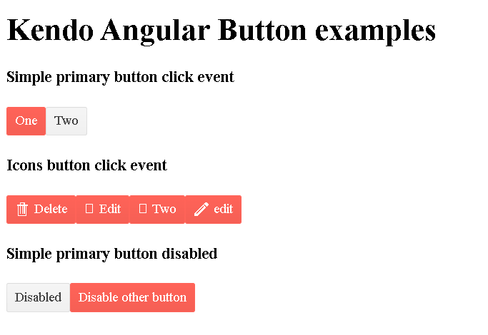
Kendo Test Angular Application
Here is an Angular kendo button complete example.
buttons-example.component.html:
<h1>Kendo Angular Button examples</h1>

<div>
  <h4>Simple primary button click event</h4>
  <button kendoButton (click)="onClick()" [primary]="true">One</button>
  <button kendoButton (click)="onClick()" [primary]="false">Two</button>
</div>

<div>
  <h4>Icons button click event</h4>
  <button kendoButton (click)="onClick()" [primary]="true" [icon]="'delete'">
    Delete
  </button>

  <button
    kendoButton
    (click)="onClick()"
    [primary]="true"
    [iconClass]="'far fa-edit'"
  >
    Edit
  </button>
  <button
    kendoButton
    (click)="onClick()"
    [primary]="true"
    [iconClass]="'fas fa-edit'"
  >
    Two
  </button>
  <button
    kendoButton
    (click)="onClick()"
    [primary]="true"
    [icon]="isEdit?'delete': 'edit'"
  >
    {{isEdit?"delete": 'edit'}}
  </button>
</div>

<div>
  <h4>Simple primary button disabled</h4>
  <button kendoButton (click)="onClick()" [disabled]="isDisabled">
    Disabled
  </button>
  <button kendoButton (click)="onClick()" [primary]="true">
    Disable other button
  </button>
</div>
buttons-example.component.ts:
import { Component, OnInit } from '@angular/core';

@Component({
  selector: 'app-buttons-example',
  templateUrl: './buttons-example.component.html',
  styleUrls: ['./buttons-example.component.scss']
})
export class ButtonsExampleComponent implements OnInit {
  public isEdit: boolean = false;
  public isDisabled: boolean = false;

  constructor() { }

  ngOnInit(): void {
  }
  onClick() {
    this.isEdit = true;
    this.isDisabled = true;

  }
}
Output:
Conclusion
Step by step by tutorial on how to add kendo buttons to Angular application with multiple examples on icon and icon class disabled.