Bulma CSS framework tutorials with examples
- Admin
- Dec 31, 2023
This post is an index page for all posts of Bulma CSS tutorials with examples.
Bulma CSS Introduction and features
Bulma is CSS opensource framework based on flexbox. which support the following features
- Responsive that works on any screen size, Like a Bootstrap framework, It is designed as per Mobile First
- Lightweight in size
- A lot of Inbuilt components and predefined SASS styles
- Better design than bootstrap
- It is based on modules that support sass files
- Customizable and extendable
Installation and Setup
Any website or HTML can be integrated with Bulma CSS in many ways.
- using bulma.min.css file directly
- CDN library
- NPM package
It is very simple to install in any web application. Just use a CSS file with a stylesheet in HTML to get access to all components and CSS styles
<link
  rel="stylesheet"
  href="https://cdnjs.cloudflare.com/ajax/libs/bulma/0.7.1/css/bulma.min.css"
/>
or if you want to use direct CSS files, Download the library from the GitHub repository and copy it to your project link the CSS file in an HTML file or To install the Npm package
npm package Bulma
Responsive Columns
The html file can be added with the below viewport meta tag to work on any screen size
<meta name="viewport" content="width=device-width, initial-scale=1" />
Columns and Levels
It is based on flexbox like a grid in bootstrap. It contains columns that have multiple column styles All the columns can be applied in the parent container CSS style. Here is an example Level is one more attribute that can be displayed elements horizontally - Level-left,level-right Columns Examples
<!doctype html>
<html>
  <head>
    <meta http-equiv="X-UA-Compatible" content="IE=edge" />
    <title>Learn Bulma CSS Tutorials with examples</title>
    <link
      rel="stylesheet"
      href="https://cdnjs.cloudflare.com/ajax/libs/bulma/0.7.1/css/bulma.min.css"
    />
  </head>
  <body>
    <div class="container">
      <div class="columns">
        <div class="column">1st column</div>
        <div class="column">2nd column</div>
        <div class="column">3rd column</div>
        <div class="column">4th column</div>
      </div>
    </div>
  </body>
</html>
Bulma is designed for mobile-first like bootstrap UI framework. Each component is displayed vertically Output is

Modifiers
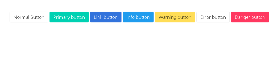
Bulma has is- and has- modifiers to apply various UI styles to UI elements. For example, is-primary add a different color to the button This example explains various button styles is-primary .is-info .is-success .is-link .is-warning .is-danger
<section class="section">
    <div class="container">
<a class="button">
  Normal Button
</a>

<a class="button is-primary">
  Primary button
</a>

<a class="button is-link">
  Link button
</a>
<a class="button is-info">
Info button
</a>
<a class="button is-warning">
Warning button
</a>
<a class="button is-error">
Error button
</a>
<a class="button is-danger">
Danger button
</a>
</div>
</section>
Output is
Bulma Layout Bulma Form Example